
Craftmanship


Sutton Tools
Responsibilities
Creative Strategy
Concept Development
User and Stakeholder Research
Segment and Personify Audience
Output
Visual Design
Print Marketing Design
Event Design
01
Essentials
“Handled with professionalism and talent, the final branding and visual design for Impression far exceeded our imaginations. Great job!”
What does higher performing packaging look like?
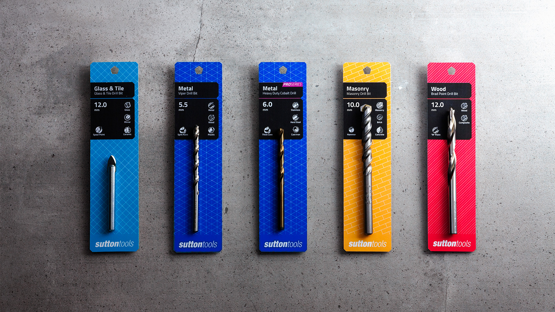
One of the more interesting facets of the packaging for Sutton Tools is; each tool has specific features and sizes, this translated to potentially thousands of variations.
The key to this design is the black box, the mass produced design has this portion remain in white. This meant that only a small number of product ‘families’ needed to be printed in advance. The unique details can be cheaply produced in single colour at smaller bulks when retail orders arrive.

Outcome
Packaging
with breadth
Simple but flexible colour, pattern and positioning.
Empowering Suttons to accommodate a broad catalogue of products
with infinite possibilities


Outcome
Constant evolution
consistent value
The diversity of the tool’s capability and purposes also meant that some products crossover in their functionality. To help alleviate this, patterns were designed to work with the existing colour palette, which allowed products to exist across multiple groups.
By keeping the design clean and simple, it means that the design can be applied to any packaging of any shape, such as hacksaws, screwdrivers and more.