Our
Precincts
Our
Precincts
A human, welcoming and dynamic visual identity, evolving some of Melbourne’s most personable precincts.
Client
City of Port Phillip
Responsibilities
Concept Development
Segment and Personify Audience
Marketing Communication
Output
Visual Design
Print Marketing Design
01
Essentials
“Well received amongst our team, we really appreciate the work you put into this. We look forward to further engagement with you.”
– Precinct Management Team
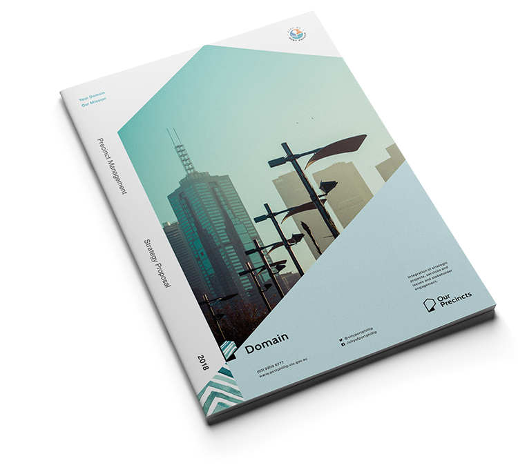
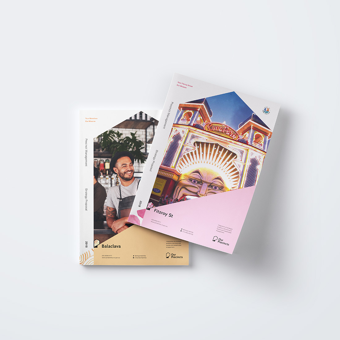
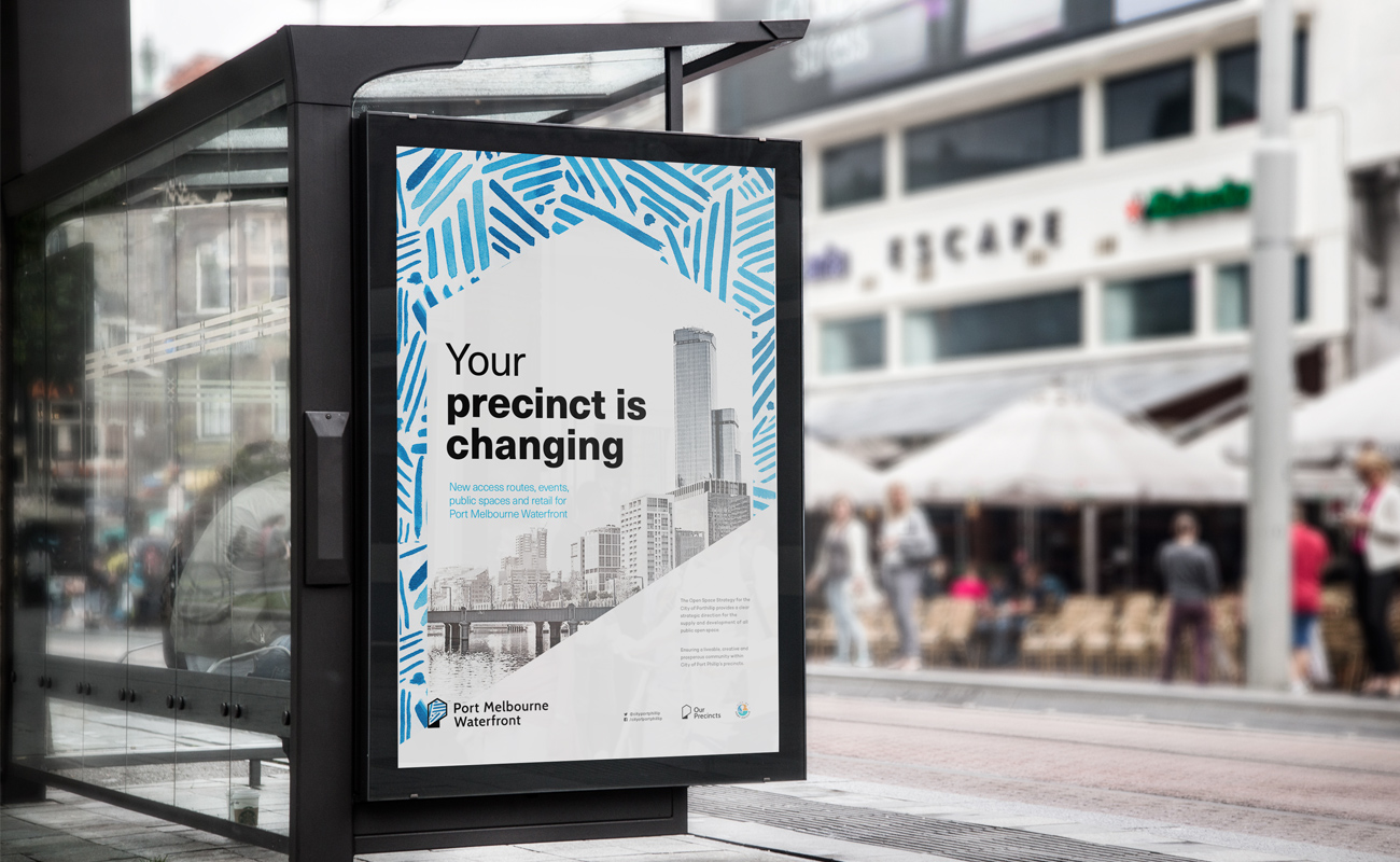
The Precinct Management initiative, by the City of Port Phillip, aims to take a focussed lense on residential and commercial community engagement.
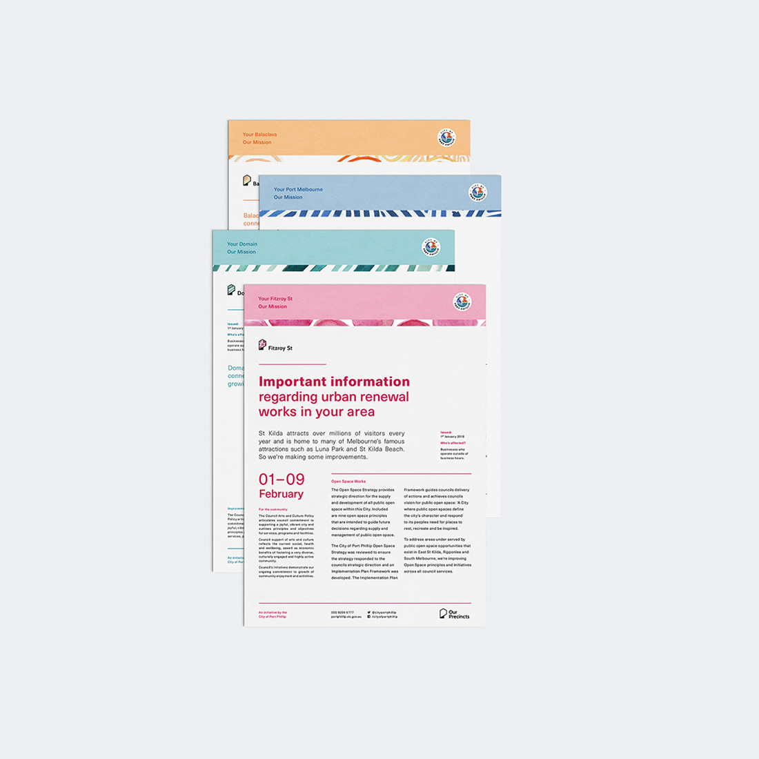
The brand system facilitates dialogue amongst constituents on activities which affect the precinct, such as urban renewal or social programmes.

Master Logomark

Logomark family

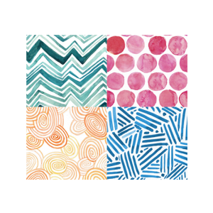
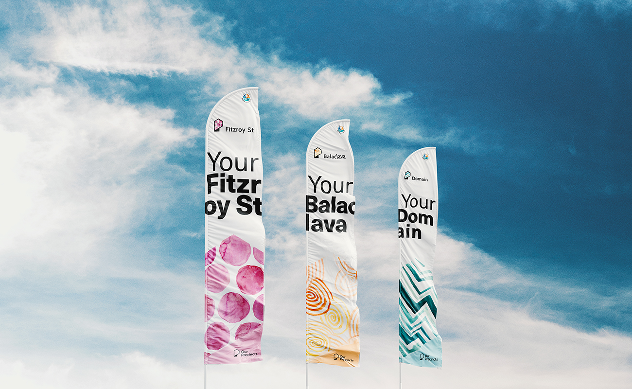
Patterns
Messaging

Philosophy
A brand with purpose, authenticity and versatility
In collaboration with the Precinct Management Team, we developed a new philosophy for City of Port Phillips approach to communications:
Be custodians for guiding precinct development, instead of a controlling authority.
By relinquishing the sense of ownership to residents, the team is able to position itself as a supporting service which nurtures and listens, not just governance and management.
Outcome
Dynamic yet familiar.
Infinite expansion capabilities.
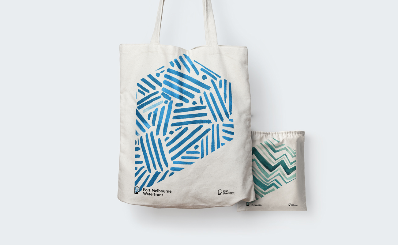
The P ‘logomark’ which is representative of a map pin and stylised home icon, can be filled with a pattern to associate it to a precinct. The advantage of this approach is the logomark remains largely unchanged, making it easy to recognise, but also affords limitless expansion opportunities. More precincts? add some patterns. Since each will only be used in communications targeted at a certain precinct’s constituents, it helps build a sense of belonging and recognition even if the user is exposed to multiple precincts.
Philosophy
Clarity in purpose. Consistency in communications.
The vision, values and goals of community betterment take center stage with support from ‘human made’ patterns and textures. These are unique to each precinct, with the masterbrand simply using black and white.
Giving each precinct a unique pattern (used across the logomark and communications) is fundamental to building this sense of ownership. Adding character and a sense of family amongst the precincts. Coupled with the use of ‘Our’ in the naming, a shared common goal of mutual prosperity becomes front and center of all communications.